目录
2-Material Outline Icons
3-切换底部导航栏项目的激活状态
4-按索引值切换显示不同的小部件(indexedStack)
*补充内容
Flutter TextButton 详细使用配置、Flutter ButtonStyle概述实践
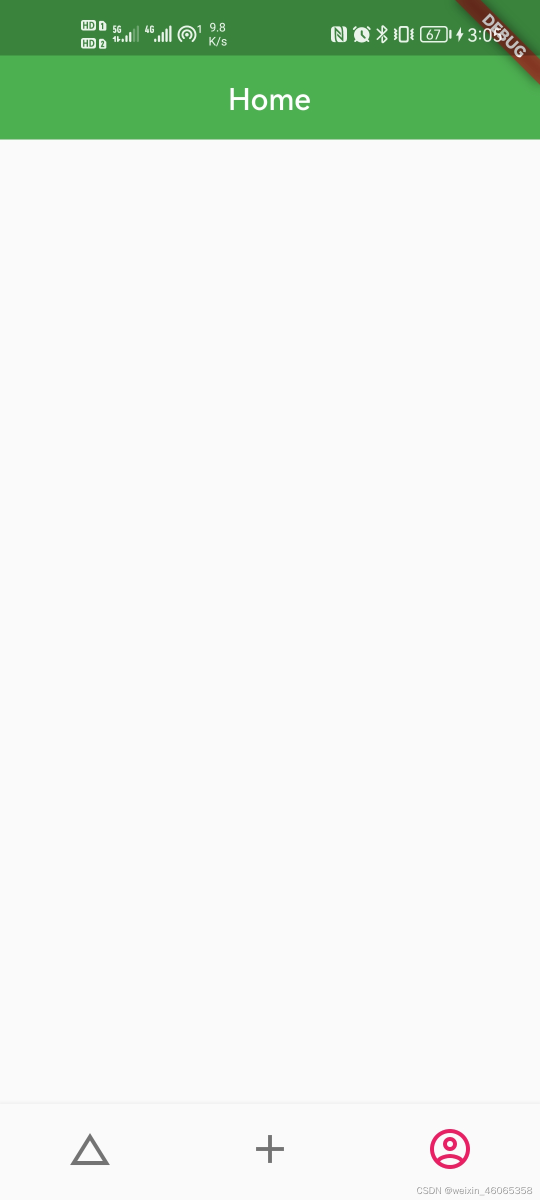
1-底部导航栏BottomNavigationBar
效果图
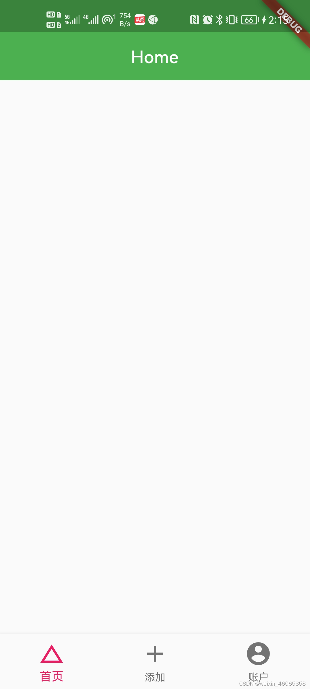
import 'package:flutter/material.dart';

class AppBottomNavigationBar extends StatefulWidget {
  @override
  State createState() => _AppBottomNavigationBarState();
}

class _AppBottomNavigationBarState extends State {
  @override
  Widget build(BuildContext context) {
    return BottomNavigationBar(
      //不显示标签文字
    showSelectedLabels:false,
    showUnselectedLabels:false,
      items: [
        BottomNavigationBarItem(
          //图标
          icon: Icon(
            Icons.change_history,
            size: 32,
          ),
          //文字内容
          label: "首页",
        ),
        BottomNavigationBarItem(
          //图标
          icon: Icon(
            Icons.add,
            size: 32,
          ),
          //文字内容
          label: "添加",
        ),
        BottomNavigationBarItem(
          //图标
          icon: Icon(
            Icons.account_circle,
            size: 32,
          ),
          //文字内容
          label: "账户",
        ),
      ],
    );
  }
}
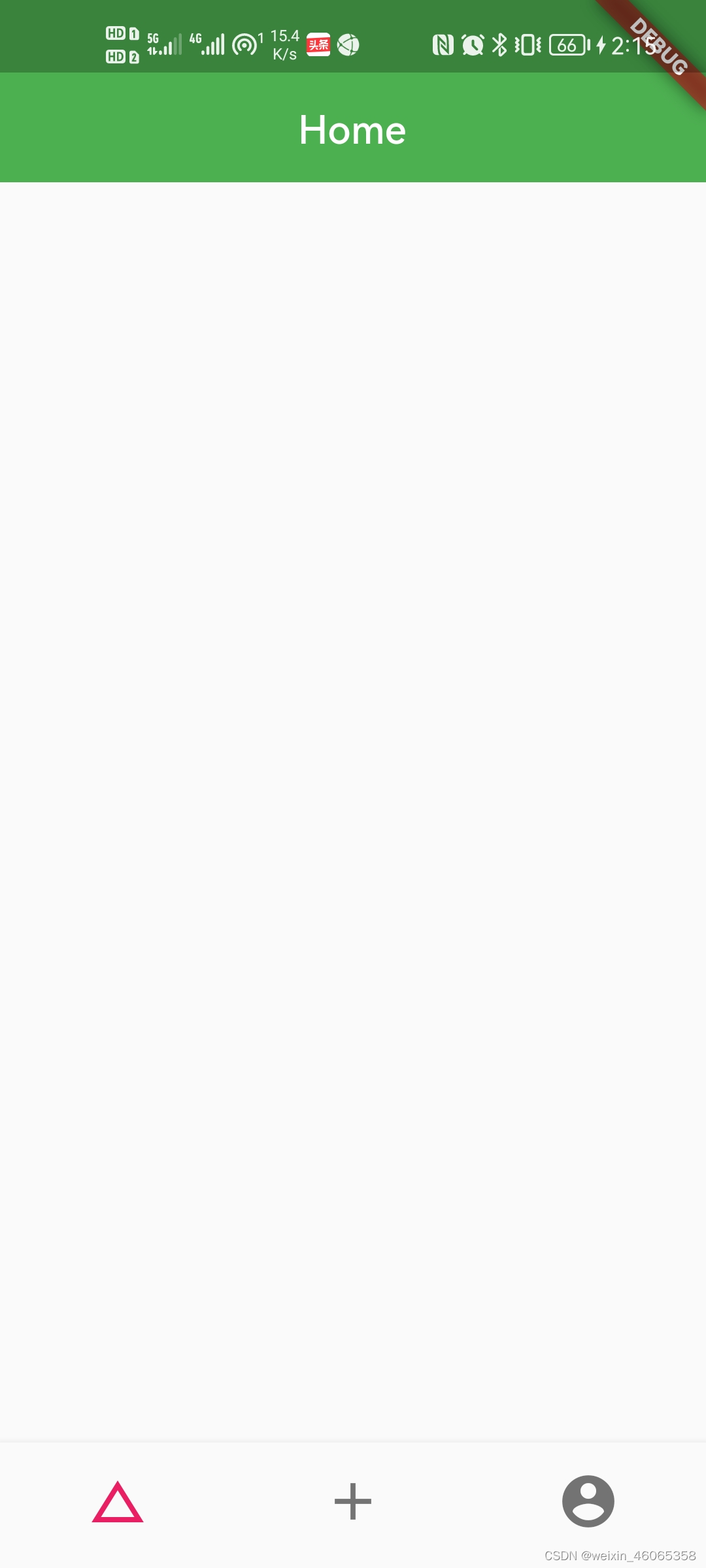
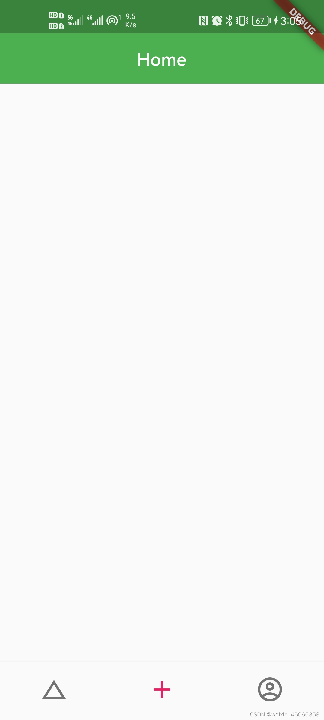
2-Material Outline Icons
Dart packages (pub.dev)
在这个网站查找插件版本,直接搜插件名字,例如“outline_material_icons”
在pubspec.yaml添加outline_material_icons: ^0.1.1
【注意层级关系,缩进不对会安装错误;出现exit code 0,表示安装成功】
dependencies:
  flutter:
    sdk: flutter
outline_material_icons: ^0.1.1| 1导入包 | import 'package:outline_material_icons/outline_material_icons.dart'; |
| 2注释 | //Icons.account_circle, |
| 3更改 | OMIcons.accountCircle, |
由于空安全可能出现
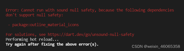
解决方案一:flutter run --no-sound-null-safety
效果图

BottomNavigationBarItem(
//图标
icon: Icon(
//Icons.account_circle,
OMIcons.accountCircle,
size: 32,
),
//文字内容
label: "账户",
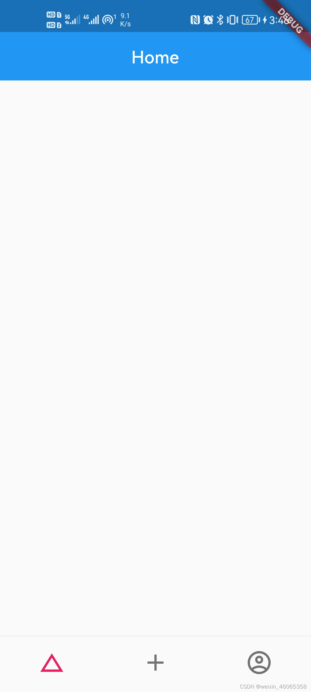
),3-切换底部导航栏项目的激活状态
Flutter入门(15):Flutter 组件之 BottomNavigationBar 详解 - 简书 (jianshu.com)
效果图
import 'package:flutter/material.dart';
import 'package:outline_material_icons/outline_material_icons.dart';

class AppBottomNavigationBar extends StatefulWidget {
  @override
  State createState() => _AppBottomNavigationBarState();
}

class _AppBottomNavigationBarState extends State {
  int _currentIndex = 0;

  void _onTap(int index) {
    setState(() {
      _currentIndex = index;
    });
  }

  @override
  Widget build(BuildContext context) {
    return BottomNavigationBar(
      currentIndex: _currentIndex,
      onTap: _onTap,
      //不显示标签文字
      showSelectedLabels: false,
      showUnselectedLabels: false,
      items: [
        BottomNavigationBarItem(
          //图标
          icon: Icon(
            Icons.change_history,
            size: 32,
          ),
          //文字内容
          label: "首页",
        ),
        BottomNavigationBarItem(
          //图标
          icon: Icon(
            Icons.add,
            size: 32,
          ),
          //文字内容
          label: "添加",
        ),
        BottomNavigationBarItem(
          //图标
          icon: Icon(
            //Icons.account_circle,
            OMIcons.accountCircle,
            size: 32,
          ),
          //文字内容
          label: "账户",
        ),
      ],
    );
  }
}
4-按索引值切换显示不同的小部件(indexedStack)
效果图


home: Scaffold(
        //body: Home(),只能展示一个页面;body: IndexedStack()栈结构展示多个页面
        body: IndexedStack(
          //index属性:当前演示小部件的索引号
          index:0,//可以取0,1,2
          children: [
            Home(),
            Add(),
            Profile(),
          ],
        ),
        //底部导航栏
        bottomNavigationBar:AppBottomNavigationBar() ,
      ),
*补充内容
Flutter TextButton 详细使用配置、Flutter ButtonStyle概述实践
*Flutter TextButton 详细使用配置、Flutter ButtonStyle概述实践 - 知乎 (zhihu.com)


